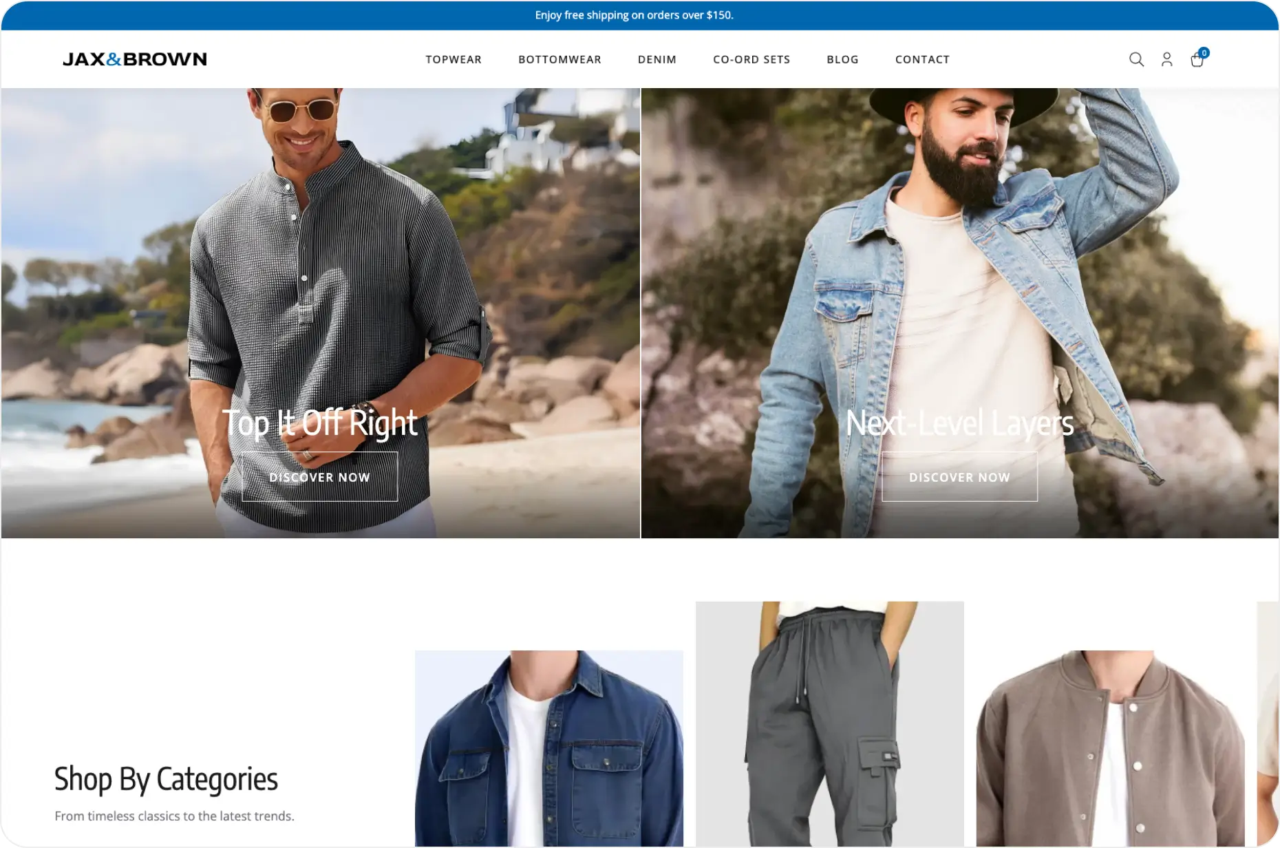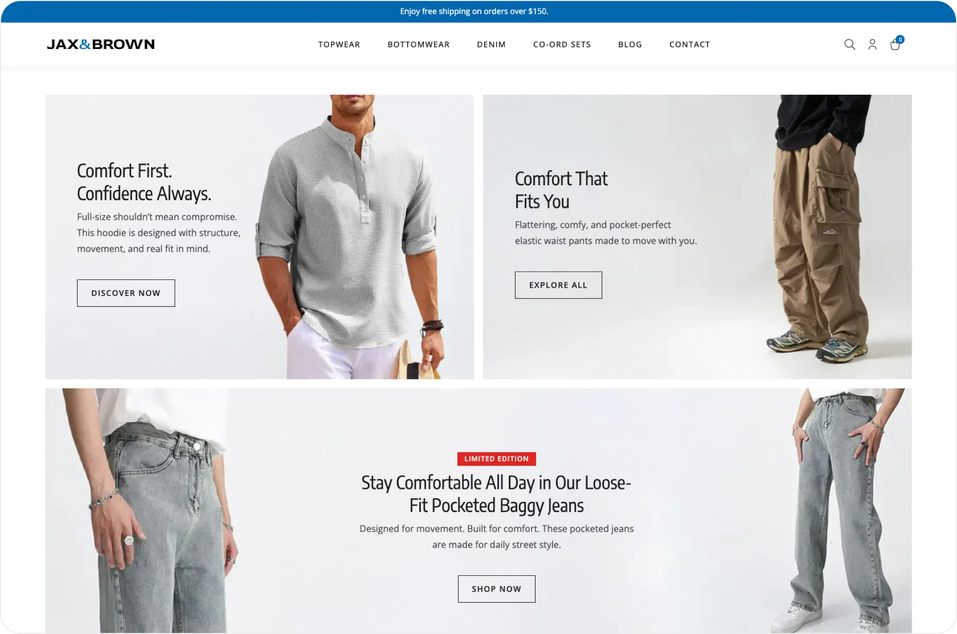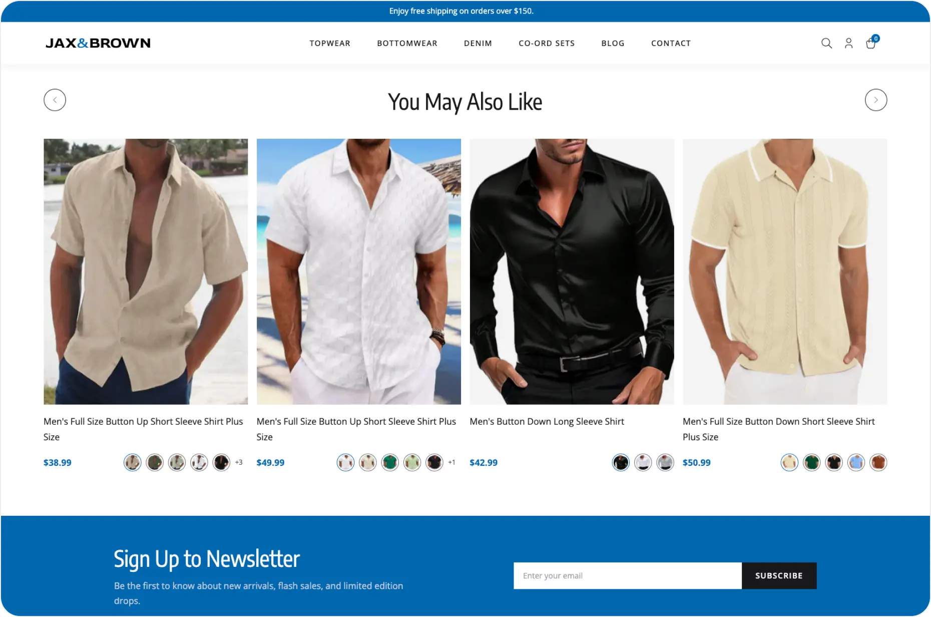
Jax&Brown is a modern menswear brand that puts comfort and confidence first.
Based in the U.S., the brand brings a fresh take to fast fashion with clean, wearable styles made for real life. Whether it’s a night out or a laid-back weekend, Jax&Brown delivers pieces that move with you and feel just right.
With over 1,000 SKUs live at any time and new collections dropping every week, the brand offers a steady stream of essentials and elevated layers. From perfectly fitting denim to plus-size styles that never compromise on looks, Jax&Brown is made for men who want fashion that fits their lifestyle — quick, easy, and always on point.
With over 1,000 SKUs live at any time and new collections dropping every week, the brand offers a steady stream of essentials and elevated layers. From perfectly fitting denim to plus-size styles that never compromise on looks, Jax&Brown is made for men who want fashion that fits their lifestyle — quick, easy, and always on point.
The Challenges
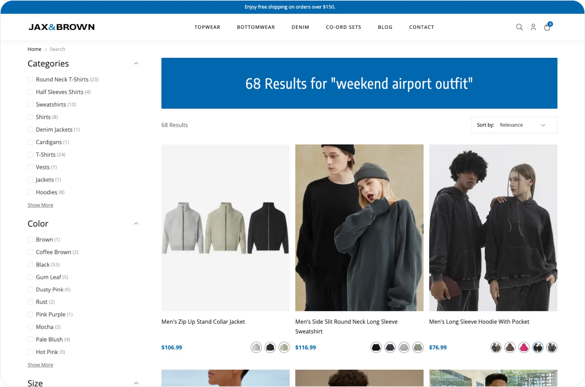
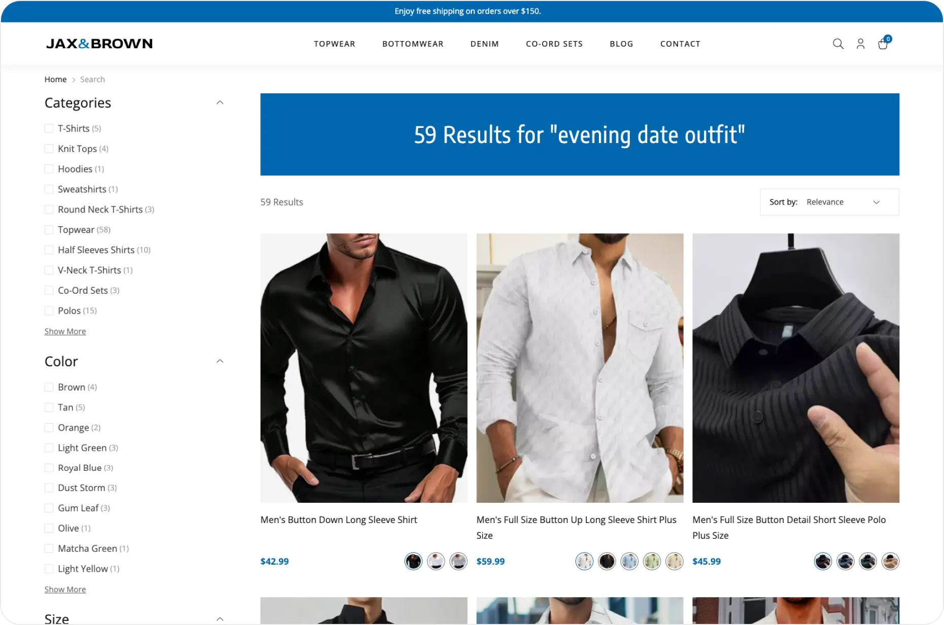
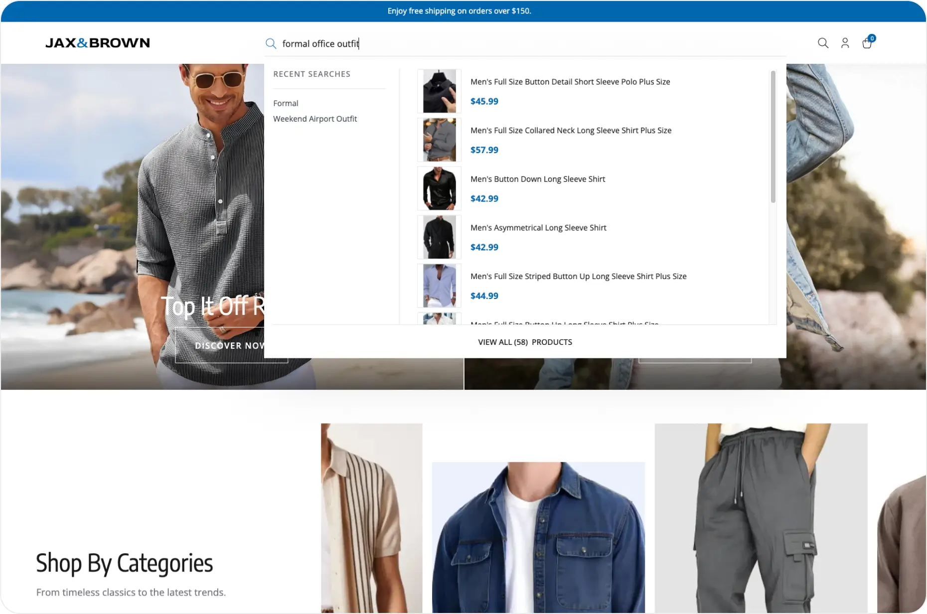
Search That Struggled With Fashion Language: When shoppers searched for things like “oversized airport fit” or “black cocktail blazer,” the site showed random results. The search engine couldn’t understand the style or vibe behind the words, so customers left without buying.
Content Updates Took Too Long: Every time the team wanted to update a banner, launch a new campaign, or change something on the homepage, they had to wait for developer support. This slowed down campaigns and made it harder to try new ideas quickly.
Mobile Experience Was Holding Shoppers Back: Most users browsed on their phones, but the experience didn’t keep up. Pages loaded slowly, filters were clunky, and the layout made it hard to find products. Many shoppers dropped off before even getting to the items they wanted.
Product Listings Were Hard to Control: Even when some products were trending or selling fast, they didn’t show up at the top. The team couldn’t easily move products around or highlight key collections without help from tech.
No Personal Touch: Whether someone was visiting for the first time or the fifth, everyone saw the same homepage and product listings. The site didn’t remember what people liked, viewed, or added to their cart—missing chances to show the right products.
More Conversions. Bigger Carts. Zero Bottlenecks.
Experro changed everything for us. Our conversions almost tripled, AOV crossed $75, and bounce rates dropped by over 60%. We can launch campaigns in minutes, update the site without any delays, and the shopping experience just feels right. Search understands what people mean, recommendations actually drive sales, and everything runs fast and smooth. It finally feels like our store is helping us grow, not holding us back.


