
core insights box
- Google’s mobile-first indexing makes it essential for a responsive mobile site to maintain a strong online visibility.
- A well-designed mobile search UI is essential for better engagement and higher sales.
- Use autocomplete and relevant suggestions to guide users without cluttering the interface.
- Choose clear fonts and intuitive icons to make searches smoother and more readable.
- Experro’s advanced mobile-first search capabilities can help you boost engagement and customer satisfaction effortlessly.
DO YOU KNOW?
- In 2025, as per the estimates, mobile commerce will account for 59% of total retail eCommerce sales.
- 30% of the worldwide digital users shop using a mobile phone.
- In the USA, 76% of all adults buy using a mobile phone.
With mobile devices becoming consumers' go-to gadget for web browsing, the importance of optimizing using mobile search best practices has become more significant than ever.
Ensuring that users find what they need quickly and easily on their smartphones isn't just good practice—it's essential. However, achieving this level of convenience requires implementing the overall eCommerce search best practices.
From responsive mobile design best practices to faster load times, the way you optimize mobile search can make or break your website's success.
Let’s dive into why following mobile search best practices are crucial for both user experience and SEO.
Why Is Mobile Responsiveness Critical for SEO & Customers?

Mobile responsiveness directly impacts how search engines rank your website and how users interact with it. Including mobile optimization in the eCommerce SEO checklist ensures that key aspects like responsiveness and speed are addressed effectively.
Google has shifted to mobile-first indexing, which means it primarily uses the mobile version of your site for ranking and indexing.
So, if your site isn’t optimized for mobile, your rankings and visibility will suffer. For users, a poor mobile experience leads to higher bounce rates and lower engagement.
Whether it’s the ease of using a mobile search bar or the speed at which pages load, users expect seamless navigation. Optimizing for mobile search UX enhances overall customer satisfaction, and when done right, it helps convert visitors into customers.
In February 2024, mobile searches made up 65.89% of global organic searches, showing the growing importance of recent searches, mobile browsing and mobile-first indexing.
This makes mobile responsiveness not just an option but a necessity.
Now, let’s learn about the mobile search best practices to follow for better user engagement.

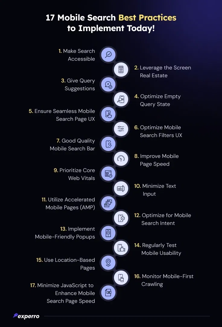
17 Mobile Search Best Practices to Induce Engagement!
Ensuring your website is optimized for mobile search is more important than ever. By following these 10+ mobile search best practices, you’ll not only enhance user experience but also learn the benefits of eCommerce SEO—from improved rankings to higher conversion rates.
Mobile Search Bar and UI/UX:
1. Make Search Easy to Find and Accessible in Mobile Search UX
Placing the mobile search bar prominently at the top of the page or within easy reach ensures users can quickly access it. A persistent search icon or bar enhances discoverability, reducing friction and improving mobile search usability. Implementing a mobile-friendly search bar with clear visibility and easy interaction is key to providing the best UX for search on mobile apps.
2. Maximize Screen Real Estate for a Better Mobile Search Experience
Mobile UX best practices emphasize making the most of limited screen space. Designing a clean, clutter-free UI ensures an optimal mobile search experience. Avoid unnecessary elements and use overlays or expandable mobile search bars to save space while keeping the mobile search functionality accessible. A well-placed mobile search box helps improve user engagement and ensures easy navigation.
3. Guide Users with Query Suggestions in Mobile Search Bar UI & UX
Using smart search UX elements like autocomplete, predictive search, and AI-driven recommendations helps users find relevant results faster. These mobile search features minimize typing effort and enhance the overall mobile search journey. Implementing autocomplete for mobile search bars can significantly reduce search friction, making it easier for users to find what they need.
4. Optimize the Empty Query State for Better Mobile Search Usability
When users tap on the search bar in mobile but haven’t entered a query, showing trending searches, categories, or recent and saved searches can improve engagement. A well-optimized mobile search box UX encourages users to explore relevant content without requiring full input, improving overall mobile search usability.
Page Experience And Design
5. Ensure a Seamless Search Experience Across Mobile Search Pages
Maintaining consistency in mobile search UX across different pages and devices is crucial. Implement smooth transitions, instant results, and real-time filtering to keep users engaged. Providing an efficient mobile product search engine with quick responses ensures a streamlined mobile search user experience.
6. Keep Users in Control with Mobile Search Filters UX
Users should have control over their searches with features like mobile search filters UX, sorting options, and easy navigation. Clear back and reset buttons help users adjust mobile search queries effortlessly. A well-designed mobile search results page allows users to refine searches efficiently.
7. Use a Responsive Design for Mobile Search Bar Examples
A fully responsive mobile search design ensures usability across different devices. The mobile search bar UI & UX should adjust dynamically to different screen sizes, maintaining an intuitive layout. This approach aligns with mobile app UX best practices.
8. Improve Mobile Page Speed to Enhance Mobile Search Ranking
Fast-loading mobile search pages improve user retention and mobile search ranking. Optimizing images, enabling lazy loading, and using efficient coding techniques can enhance mobile search speed, reducing load times for search-driven interactions.
9. Prioritize Core Web Vitals to Strengthen Mobile-First Experience
Google’s Core Web Vitals—Largest Contentful Paint (LCP), First Input Delay (FID), and Cumulative Layout Shift (CLS)—are essential for a strong mobile-first experience. Optimizing mobile search UX with improved speed, interactivity, and stability boosts engagement and rankings.
Smart Search And Personalization
10. Minimize Text Input Using Smart Search UX
Reduce typing effort by integrating voice search, barcode scanning, and smart autofill options. Implementing modern advanced search UI design elements makes searching more intuitive, benefiting users who rely on mobile app search.
11. Utilize Accelerated Mobile Pages (AMP) for Mobile Search Speed
AMP ensures fast-loading mobile search results pages, reducing bounce rates and improving engagement. A well-optimized mobile search strategy should incorporate AMP where necessary.
12. Optimize for Mobile Search Intent and Mobile ECommerce Search
Aligning search results with user intent—whether navigational, informational, or transactional—is crucial. A strong mobile search strategy should consider search intent optimization to improve mobile eCommerce search performance.
Technical SEO And Performance
13. Implement Mobile-Friendly Popups Without Disrupting Mobile Search UX
Minimize intrusive interstitials that disrupt mobile search UX. Ensure popups provide value and are easily dismissible, enhancing the mobile experience design.
14. Regularly Test Mobile Usability for Mobile UX Best Practices
Conduct usability testing and A/B experiments to refine mobile UX patterns. Continuous optimization helps improve the mobile search user experience.
15. Use Location-Based Pages to Improve Mobile Search Discovery
Leveraging geolocation improves mobile search discovery by delivering personalized results. Local search optimization enhances mobile site search relevance.
In short, these type of geo-location pages help enhance product search and discovery.
16. Monitor Mobile-First Crawling for Better Mobile Search Ranking
Google’s mobile-first indexing ensures mobile versions of pages are prioritized. Ensuring structured data and metadata align with mobile search ranking strategies improves visibility.
17. Minimize JavaScript to Enhance Mobile Search Page Speed
Excessive JavaScript can slow down mobile search pages. Optimize scripts and use lightweight frameworks to enhance mobile search speed.
How Can Experro’s AI Capabilities Improve Your Mobile Search Strategy?

Experro helps you seamlessly follow each of these mobile search best practices. From responsive design and fast page loading times to advanced search mobile UX patterns, we ensure your site provides the best possible user experience.
With AI-powered search, we optimize mobile search functionality, making it easier for customers to find what they need.
Whether it’s testing mobile usability or improving core web vitals, Experro provides the features to enhance every aspect of your mobile search strategy.
With our focus on personalized content, mobile search bar UI design, and location-based pages, you’ll deliver a tailored experience that keeps users engaged.
Conclusion
As mobile usage continues to grow, optimizing your site for in-app search has become non-negotiable.
By implementing these mobile search bar best practices, from responsive design to monitoring a mobile-first eCommerce website, you can significantly improve both SEO performance and user satisfaction.
Whether it’s minimizing text input or enhancing the mobile search bar design, every detail contributes to a seamless experience.
Experro can help you stay ahead by providing the right features to execute these strategies effectively. A well-optimized mobile experience design leads to higher engagement, lower bounce rates, and ultimately, better business outcomes.
For more insights on Mobile-first approach for your website, connect with our experts on a call.
FAQs

Pallavi is an ambitious author recognized for her expertise in crafting compelling content across various domains. Beyond her professional pursuits, Pallavi is deeply passionate about continuous learning, often immersing herself in the latest industry trends. When not weaving words, she dedicates her time to mastering graphic design.
Subscribe to Our Newsletter!
Get the latest insights delivered straight to your inbox.


